
ANNUAL COMPETITION · OPEN-SOURCE TOOLS · REAL-WORLD IMPACT
Data Visualization Challenge
Students turn complex geospatial and climate datasets from the Climate Risk Database into compelling visual stories — solving real problems for real clients using open-source tools. Every visualization drives action.
HOW IT WORKS
Turning data into decisions
The Data Visualization Challenge is an annual competition where university students use real geospatial datasets from the Resilience Academy Climate Risk Database to create visualizations that solve real problems for real clients.
01
Real Datasets
Students access geospatial and climate data straight from the Climate Risk Database — flood extents, building footprints, critical infrastructure.
02
Skills Training
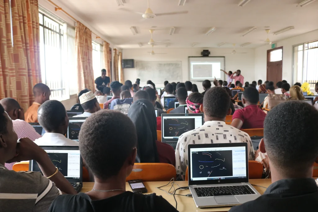
Hands-on workshops in QGIS, Google Earth Engine, Python and other open-source tools for spatial analysis and visualization.
03
Client Briefs
Real organisations — NGOs, city councils, and development agencies — pose the data-driven problems that need solving.
04
Present & Win
Teams present their solutions to a panel of judges. The best visualizations are published, awarded prizes, and put to work.
PAST EDITIONS
Challenge editions & winning projects
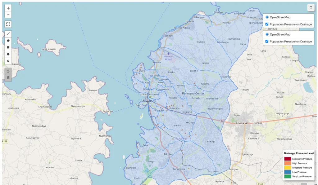
Water Security & Climate Resilience
The Winners Group Visualizing Population Pressure and Drainage Infrastructure Gaps in Mwanza City
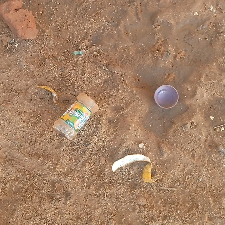
Urban Greening, Urban Infrastructure & Litter
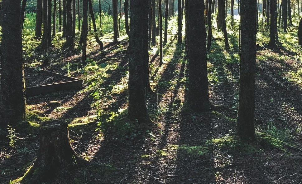
Urban trees, drainage & integrated planning
Conservation Group Carbon sequestration to address urbanization — Mikocheni, Dar es Salaam

Resilient Cities in Tanzania
2025/26 APPLICANT POOL
From application to final pitch
85 students in 23 groups applied across the four partner universities. Every group completed mentorship and skills training — 6 groups (23 students) advanced to the Final Pitching Event.
38
State University of Zanzibar · 10 groups
17
University of Dar es Salaam · 5 groups
18
Sokoine University of Agriculture · 4 groups
12
Ardhi University · 4 groups
OPEN-SOURCE TOOLKIT
Skills that go beyond the competition
Participants train on the same industry-standard, open-source tools used by GIS professionals, data scientists and urban planners worldwide — skills that translate directly into employability.
QGIS
Spatial analysis, cartography & the challenge’s primary GIS environment
Google Earth Engine
Cloud-based satellite imagery & large-scale geospatial analysis
Python (GeoPandas, ML)
Data processing, machine-learning models & automation
Kepler.gl
Large-scale geospatial data exploration & interactive web maps
Datawrapper
Fast, clean charts and maps for storytelling
Google My Maps
Lightweight, shareable custom maps
“The Data Visualization Challenge gave me skills I use every day as a GIS analyst. Working with real flood data and real clients is something a classroom can’t replicate.”
A Data Visualization Challenge finalist
STUDENT WORK
Featured visualizations
Selected outputs from the 2025/26 challenge — each tells a data story that helped a real client make better decisions.
Population Pressure & Drainage Infrastructure Gaps
The Winners Group · Sokoine University of Agriculture · 2025/26
Flood Susceptibility & Infrastructure Planning, Mirongo River
GeoAdaptive Mappers · SUA / ARU / UDSM · 2025/26
HydroPredict AI — Flood Risk & Urban Growth
HydroPredict AI · State University of Zanzibar · 2025/26
Urban Growth & Flood Risk Intersection, Mwanza & Tanga
Urban Futures · Ardhi University · 2025/26
OUR PARTNERS
Challenge clients & supporters
Organisations that provide real-world problems and datasets, mentor students, and help put winning solutions to work.









Ready to turn data into impact?
Whether you’re a student looking to build your portfolio, or an organisation with a real problem to solve — the next edition needs both.